By Alex Jackson on 20 Feb 2014
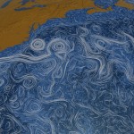
From an early visual representation of a hierarchically ordered universe in Robert Fludd’s ‘Great Chain of Being’ (1617) to a contemporary moving infographic of ocean currents from NASA, a free new exhibition in London shows how visualising data has changed the way we see, interpret and understand the world around us. Read more
Posted in Events, Featured, Nature Graphics, Science communication and outreach, Uncategorized | Tagged art, Communities Happenings, exhibitions, graphics, infographics, science communication