TechBlog: Interactive figures address data reproducibility

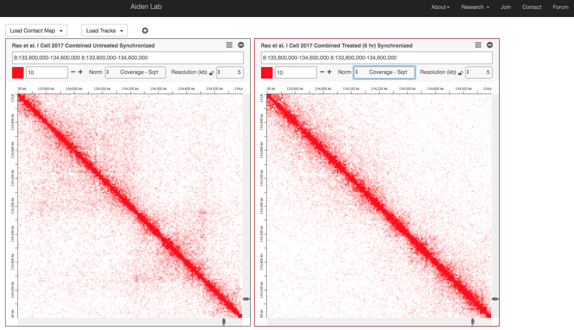
Juicebox.js

Juicebox.js{credit}Screenshot/Jeffrey Perkel{/credit}

Data reproducibility and transparency mean different things to different people, but one aspect involves allowing scientists to view and manipulate the data or code underlying published figures, both to double-check others’ work and to repeat those analyses using custom data. Over the past year, for instance, the open-access journal F1000Research has implemented integrations with Code Ocean and Plotly for viewing and manipulating programming code and figures, respectively. Now, a new publication showcases interactive figures for 3D genome analysis, too.

Continue reading

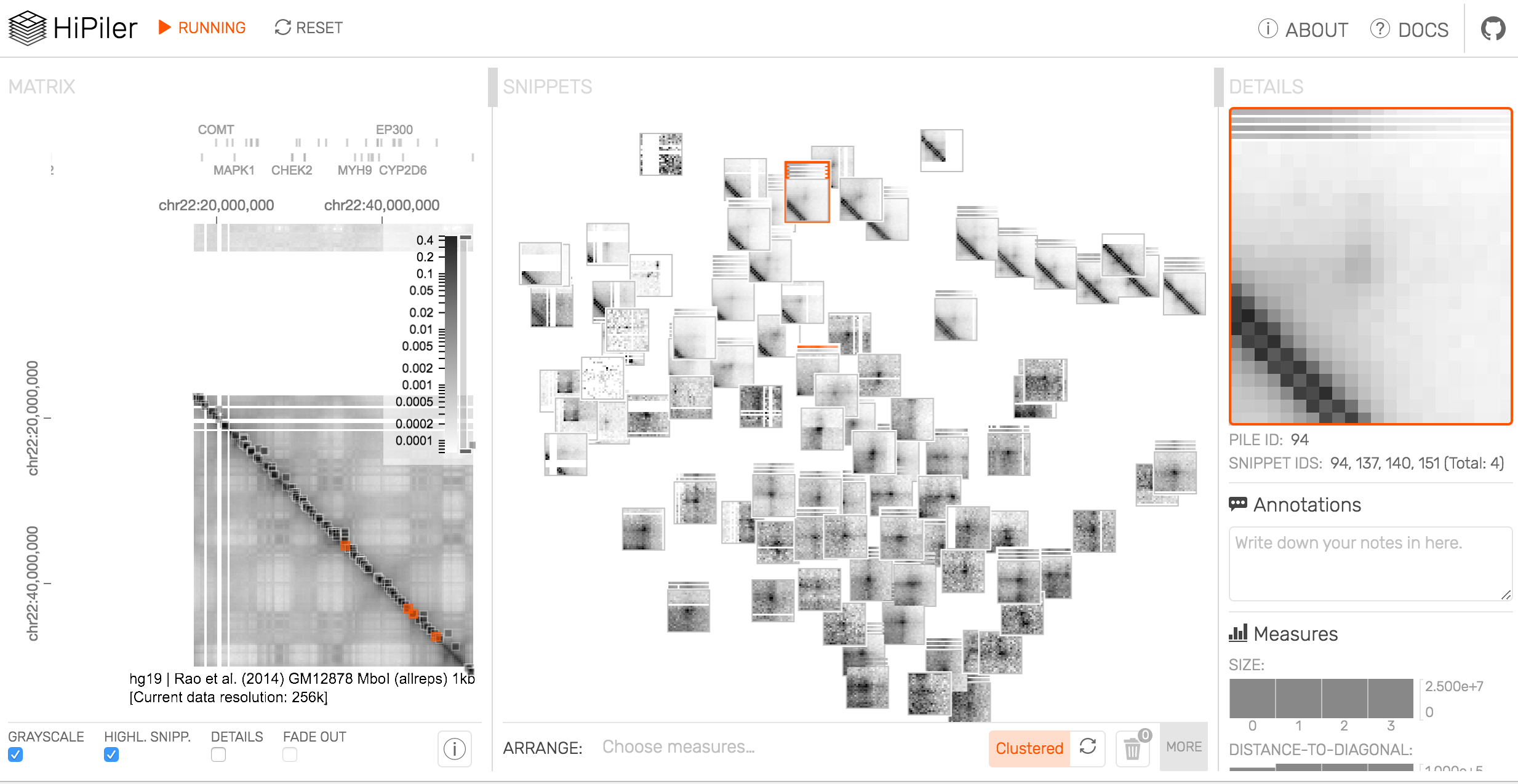
TechBlog: HiPiler simplifies chromatin structure analysis

Screen Shot 2017-09-07 at 12.29.30 PM

For my recent Toolbox on 3D genome visualization tools, Nils Gehlenborg at Harvard Medical School clued me into two interesting pieces of software. One, HiGlass, was included in my article; a related tool, HiPiler, was not. But that doesn’t mean it’s not worth talking about.

Continue reading

TechBlog: Mike Goodstadt: A circuitous route to bioinformatics

Mike Goodstadt (2)

{credit}CNAG-CRG{/credit}

Most coders come to bioinformatics by one of two routes. They’re either biologists skilled in programming, or programmers with an interest in biology. Mike Goodstadt, the programmer behind the genome-visualization tool TADkit, took a different approach.

In the early-to-mid 1990s, Goodstadt was a student at the University of Bath in the UK. His course of study: Architecture. Continue reading